History

Liquidity

As we wrap up the first half of 2018, Liquidity is still king.  Liquidity describes the degree to which an asset or security can be quickly bought or sold in the market without affecting the asset's price. It also refers to the flow of purchasing power into or out of a market. In recent years the largest source of liquidity entering the market has been central bank asset purchases (aka Quantitative Easing or QE). These asset purchases started as a reaction to Great Recession of 2008-2009. The largest three central banks (the US Federal Reserve, the European Central Bank, and the Bank of Japan) have added liquidity to global markets in relay fashion over the past eleven years as shown here in the following charts from Haver Analytics and Yardeni Research:

CentralBankAssets.JPG

While each of these banks have not individually bought continuously, the combined effect has been continuous purchases of nearly $12 Trillion of assets bought with money created  "out of thin air" for that purpose.

CentralBankTotalAssets.JPG

Rather unsurprisingly, these continuous asset purchases, and the confidence such liquidity has inspired among investors, have driven prices of stocks and bonds upwards for years...

(Additional investment specific commentary follows for client subscribers)

References:

http://stockcharts.com
https://www.yardeni.com/pub/peacockfedecbassets.pdf
https://abcnews.go.com/Politics/wireStory/trump-backs-off-imposing-china-investment-limits-56197065
https://www.yardeni.com/pub/peacockfedecbassets.pdf
https://www.investopedia.com/terms/l/liquidity.asp

SVANE CAPITAL, LLC IS A REGISTERED INVESTMENT ADVISOR.  INFORMATION PRESENTED IS FOR INFORMATIONAL AND EDUCATIONAL PURPOSES ONLY AND DOES NOT INTEND TO MAKE AN OFFER OR SOLICITATION FOR THE SALE OR PURCHASE OF ANY SPECIFIC SECURITIES, INVESTMENTS, OR INVESTMENT STRATEGIES. INVESTMENTS INVOLVE RISK AND UNLESS OTHERWISE STATED, ARE NOT GUARANTEED. INTERNATIONAL INVESTING INVOLVES SPECIAL RISKS INCLUDING THE POSSIBILITY OF SUBSTANTIAL VOLATILITY DUE TO CURRENCY FLUCTUATIONS AND POLITICAL UNCERTAINTIES. AN INVESTMENT CONCENTRATED IN SECTORS AND INDUSTRIES MAY INVOLVE GREATER RISK THAN A MORE DIVERSIFIED INVESTMENT. THERE IS NO ASSURANCE THAT A DIVERSIFIED PORTFOLIO WILL PRODUCE BETTER RETURNS THAN AN UNDIVERSIFIED PORTFOLIO, NOR DOES DIVERSIFICATION ASSURE AGAINST MARKET LOSS.  ANY GRAPH PRESENTED CANNOT IN AND OF ITSELF BE USED AS THE SOLE DETERMINANT IN MAKING AN INVESTMENT DECISION. GRAPHS ARE HISTORICAL DEPICTIONS AND HAVE INHERENT LIMITATIONS IN MAKING INVESTMENT DECISIONS AND CANNOT PREDICT THE FUTURE RESULTS OF ANY INVESTMENT. PAST PERFORMANCE IS NOT AN INDICATION OF FUTURE PERFORMANCE. BE SURE TO FIRST CONSULT WITH A QUALIFIED FINANCIAL ADVISER AND/OR TAX PROFESSIONAL BEFORE IMPLEMENTING ANY STRATEGY DISCUSSED HEREIN.

Everything is Awesome!!

Everything is awesome
Everything is cool when we’re part of a team
Everything is awesome
When we’re living our dream
— The Lego Movie theme song (2014 Warner Brothers)

The theme song (at least the first line of it) from Warner Brothers 2014 surprise hit, The Lego Movie, is an apt illustration of our current market and economic situation. Everything is awesome. US construction spending increased to an all-time high of $1.25 trillion. Payrolls are increasing and unemployment has reached official levels only rarely seen in the past century. According to ADP and Moody's Analytics, private companies hired 234,000 jobs in January. This was well above expectations for 185,000. Service-related industries led with 212,000 new jobs; manufacturing added 12,000 and construction 9,000.

Not only are jobs being added, but wages are now increasing at the highest rate since 2008 (shown below in the rising Employment Cost Index YoY as calculated by Bloomberg).

Household Net Worth to US GDP

Stock markets remain in one of the biggest bull markets in history. Over the past year, rising prices and optimism have surged to new highs. In fact just this week the Conference Board Consumer Confidence released data showing that the percentage of respondents who think the stock market will be higher this year reached an all-time record. Since the question was first asked back in early 1987, we can't look back any farther than 30 years with this data point. But this much is clear, at no time in recent decades have people been as bullish on stocks as they are today.

Effective Federal Funds Rate

Everything is awesome, indeed!

If you've seen The Lego Movie (and we highly recommend it), you know that when everything is awesome, it might only be surface deep. That, in fact, is one of the main points of the wonderful satire. Smiley faces are not the same as deeply anchored joy.  Bread and circuses (Starbucks, Netflix, and XBox?) are entirely different than independence, freedom, and opportunity. But, we digress.

As bond market maven, Jeffrey Gundlach (he of Bond King fame) succinctly pointed out this week, there is another way to look at things.

Interest rates up, $ down, and mania sentiment everywhere...a dangerous cocktail.
— Jeffrey Gundlach (CEO of DoubleLine Capital)

At the same time that stock markets and optimism have surged, interest rates have soared, inflation has gathered steam, and the international purchasing of the US dollar has fallen off the proverbial cliff. Why?

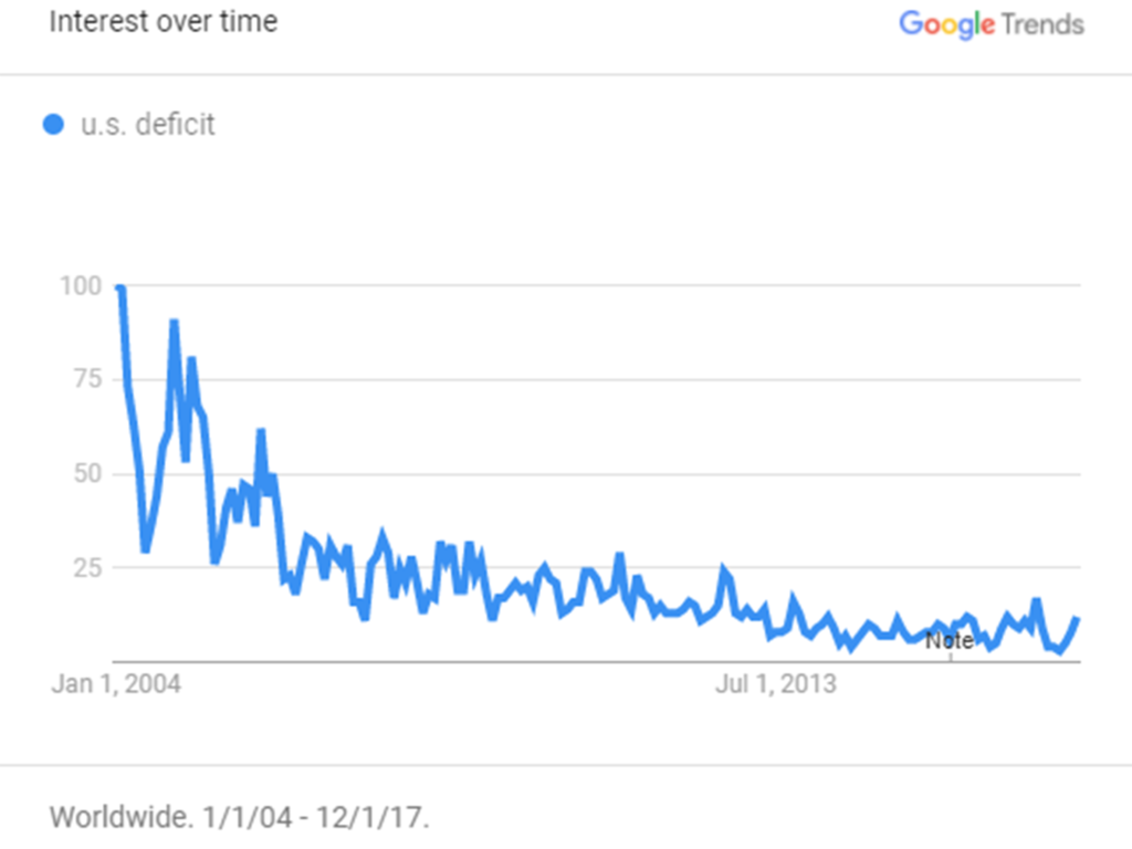
One reason is the long term structural concerns of the United States' fiscal position. This has recently been far from the radar of most casual economic observers. Do you even hear about  budget deficits anymore?  According to this chart of Google searches over the past decade, it has clearly fallen from public conscience.

Household Net Worth to US GDP

Household Net Worth to US GDP

In 2017, the US Federal budget deficit was $700 billion in round numbers. The public debt surpassed $20 trillion. Only a few years ago, (2008) the debt surpassed $10 trillion for the first time. The budget deficit is expanding and doing so late in the market/business cycle which would typically be a period of decreasing deficit (and ideally a surplus). Under the new tax bill, this yawning discrepancy will grow by hundreds of billions. 

Rising interest rates will likely have a significant additional impact. The Congressional Budget Office (CBO) estimates that for each percentage increase in interest rates, the deficit will rise by about $140 billion. This impact will be felt soon because about half of the debt matures in the next three years.

On top of that, there isn't much room for a reduction in total government spending without cutting welfare and other transfer program payments (and breaking the associated social contracts). 70% of federal spending is either interest payments or these transfer programs. (The largest remaining component, defense spending, appears more likely to increase than decrease in the current geopolitical environment.) 

Additionally, a large amount of tax receipts are directly or indirectly related to rising asset prices. Capital gains account for about $0.20 of every tax dollar brought in by the Treasury. If asset prices were to stop rising (no decline necessary) then this alone would substantially impair the fiscal outlook.

In recent years, much of the debt financing was absorbed by the Federal Reserve (and other central banks) quantitative easing (QE) programs. As central banks shift policies away from bond buying (QE) to bond selling or balance sheet reduction known as quantitative tightening (QT), the net issuance of bonds that the rest of the market has to support increases dramatically. For example, the US net issuance of treasury bond in 2017 was $357 billion, but in 2018 is forecast by JPMorgan to increase to $828 billion.    

The math fiscal math isn't pretty. Since the need for funding won't slow down, government borrowing will need to increase. This need to attract funds from lenders will put continued upward pressure on interest rates, downward pressure on the purchasing power of the dollar, or both. Financial assets are valued by projecting a future stream of income and then discounting these future dollars by an interest rate. Interest rates and currency concerns affect the value of them all. 

(Additional investment specific commentary follows for client subscribers)

References:

https://www.cnbc.com/2018/01/31/private-jobs-up-234k-in-january-vs-185k-est-adp-moodys-analytics.html
https://www.bloomberg.com
http://tocqueville.com/tocqueville-gold-strategy-fourth-quarter-2017-investor-letter/
https://www.cnbc.com/2018/02/01/us-construction-spending-rises-as-private-outlays-hit-record-high.html
https://www.ft.com/content/8eae2e72-fb74-11e7-a492-2c9be7f3120a
https://www.etftrends.com/2018-outlook-for-equity-fixed-income-alt-investors/

SVANE CAPITAL, LLC IS A REGISTERED INVESTMENT ADVISOR.  INFORMATION PRESENTED IS FOR INFORMATIONAL AND EDUCATIONAL PURPOSES ONLY AND DOES NOT INTEND TO MAKE AN OFFER OR SOLICITATION FOR THE SALE OR PURCHASE OF ANY SPECIFIC SECURITIES, INVESTMENTS, OR INVESTMENT STRATEGIES. INVESTMENTS INVOLVE RISK AND UNLESS OTHERWISE STATED, ARE NOT GUARANTEED. INTERNATIONAL INVESTING INVOLVES SPECIAL RISKS INCLUDING THE POSSIBILITY OF SUBSTANTIAL VOLATILITY DUE TO CURRENCY FLUCTUATIONS AND POLITICAL UNCERTAINTIES. AN INVESTMENT CONCENTRATED IN SECTORS AND INDUSTRIES MAY INVOLVE GREATER RISK THAN A MORE DIVERSIFIED INVESTMENT. THERE IS NO ASSURANCE THAT A DIVERSIFIED PORTFOLIO WILL PRODUCE BETTER RETURNS THAN AN UNDIVERSIFIED PORTFOLIO, NOR DOES DIVERSIFICATION ASSURE AGAINST MARKET LOSS.  ANY GRAPH PRESENTED CANNOT IN AND OF ITSELF BE USED AS THE SOLE DETERMINANT IN MAKING AN INVESTMENT DECISION. GRAPHS ARE HISTORICAL DEPICTIONS AND HAVE INHERENT LIMITATIONS IN MAKING INVESTMENT DECISIONS AND CANNOT PREDICT THE FUTURE RESULTS OF ANY INVESTMENT. PAST PERFORMANCE IS NOT AN INDICATION OF FUTURE PERFORMANCE. BE SURE TO FIRST CONSULT WITH A QUALIFIED FINANCIAL ADVISER AND/OR TAX PROFESSIONAL BEFORE IMPLEMENTING ANY STRATEGY DISCUSSED HEREIN.

Rubber Duckies

Imagine a bathtub full of rubber duckies. Most of them are bright yellow and cheerful eyed with permanent Mona Lisa beaks. But perhaps there are a few other colors, shapes, and sizes mixed in. Maybe, if this particular bathtub is anything like the one I remember my kids playing in, there are a few plastic sharks, whales, and maybe a penguin or a platypus thrown in for good measure. My favorite was always the wind-up scuba diver flippering along endlessly intrigued by who-knows-what under the bubbles. Regardless of the particulars of the floating toys, when you turn on the bath water they all float. Water in, duckies up. Water out, duckies down.

Asset prices and money (credit) behave in much the same way. When there is more money around, assets appreciate (expansion) and when there is less money around, assets depreciate (contraction). Money in, prices up, Money out, prices down.

This is obviously a simplification excluding the longer term human factors in the economic process (namely innovation and population growth). However, it serves our purpose as a way to visualize boom and bust market dynamics. An booming market can defined as the value of the stuff (stocks, bonds, real estate, money markets) people own going up relative to the size of the economy (GDP) and a bust defined as the inverse. This ratio (Household Net Worth to GDP) is shown in the following chart well over half a century.

Household Net Worth to US GDP

Household Net Worth to US GDP

During the period of 1945 to the early 1990's the price of assets (measured in units of economic production) remained range bound. Measured this way, asset valuations gradually rose into the early 1960's, fell as inflation became pronounced and eventually peaked in 1980, and then rose again ending entire fifty-year period close to where they began.

However, since the early 1990's the credit and market cycles have been particularly pronounced with asset valuations rising substantially overall with sharp corrections during the recessions following the tech stock boom of the late 1990's and the housing bubble culminating in the Great Recession of 2008- 2009. Over the past 25 years, aggregate asset valuations rose over 40% according to this measure.

Going back to our rubber ducky analogy, the household net worth line in the chart above is similar to the rise and fall of the floating toys (e.g. prices of stocks, bonds, real estate) in the bath. Why do they go up and down? Because of the amount of water (money/credit) in the tub.

A boom is created by a combination of available money (money, debt, credit are fairly interchangeable) and a reason (a narrative or story) to buy. There are almost as many ways to measure amounts of money and credit in our modern economic system as there are economists. Certain types of credit and debt instruments have become much more liquid and increasingly used to buy assets at the macro (Inter-bank) level. We'll use treasury securities, government agency securities (Fannie Mae mortgage securities for example), and Federal Reserve credit. The prevailing narrative depends on the period.

In 1990, there were about $2.5T of Treasury Securities, $1.5T of Agency Securities and $340B of Federal Reserve Credit. These three sources added up to $4.25T, or 71% of GDP. A decade later, at the end of 2000, the total stood at $8.34T or 81% of GDP (Treasury $3.36T, Agency $4.35T, Fed $635B). The narrative of that era was American Technological Dominance. This was the era when the Cold War was one, when America displayed overwhelming military force in Iraq (Operation Desert Storm), when the personal computer became ubiquitous, and the Internet was born. Confidence and optimism abounded. Booming markets fueled by credit growth certainly didn't hurt.

And then the technology bubble burst, resulting in widespread bankruptcies among Internet, telecom, and technology companies. The result ultimately was large stock market losses (particularly the richly-valued technology stocks), and a US Fed determined to rapidly drop interest rates (at the time the prominent Central Bank tool) and "reflate" the markets.

The chart below shows the course of Federal Reserve interest rates over the same time horizon as the net worth chart from before. This shows the Fed's efforts to react to recessions (the grey bars on the chart) by lowing borrowing rates aggressively. A critical aspect of our analysis is that there is no free lunch in economics and no way to "print to prosperity". Deliberate intervention in markets carries a cost even if that cost is not immediately recognized. 

Effective Federal Funds Rate

Effective Federal Funds Rate

In 2002 economist Paul Krugman, Nobel prize winning professor of economics at MIT and Princeton wrote about the difference between typical economic fluctuations and credit boom-bust dynamics. He even specifically called for the Fed to create a housing bubble to replace the Nasdaq bubble! The following is a direct quote from his "Dubya's Double Dip" article written in August 2002 in the New York Times, "The basic point is that the recession of 2001 wasn't a typical postwar slump, brought on when an inflation-fighting Fed raises interest rates and easily ended by a snapback in housing and consumer spending when the Fed brings rates back down again. This was a prewar-style recession, a morning after brought on by irrational exuberance. To fight this recession the Fed needs more than a snapback; it needs soaring household spending to offset moribund business investment. And to do that, as Paul McCulley of Pimco put it, Alan Greenspan needs to create a housing bubble to replace the Nasdaq bubble. Judging by Mr. Greenspan's remarkably cheerful recent testimony, he still thinks he can pull that off." 

The housing bubble was indeed created. As all good replacement bubbles must, it exceeded the previous bubble in scope. Toward the end of the mortgage finance and housing price bubble in 2007, Treasury securities exceeded $6.0T, Agency securities had surged to $7.4T and the Fed's balance sheet chipped nearly another trillion dollars at $950B. The total then stood at $14.4T or 99% of GDP.

The narrative shifted to the American Dream of Home Ownership (also plausibly named "Real Estate Always Goes Up"). With mortgages easy to obtain and rates declining, the lure of gains and fear of missing out combined with widely availability of real estate financing to drive prices upwards. Eventually rising interest rates and declining affordability slowed the boom. A recognizable characteristic of credit booms is that when the growth ends, a bust follows.

We know what happened next. In 2007, the housing bubble popped and credit growth turned sharply negative as one lender after another approached bankruptcy. The Federal Reserve repeated its burst bubble prescription, recently learned in the early 2000's, and turned again to forcing interest rates lower and encouraging credit growth. This time though, lower interest rates and optimistic talk weren't encouraging enough. The FASB accounting standards board changed rules to no longer require banks to value their credit portfolios at market prices and the Fed created a new tool. Called Quantitative Easing (QE), Central Banks led by the US Fed began creating money to purchase bonds and other credit instruments. These efforts stopped the bust in its tracks,and got credit growing again by early 2009. As shown below, heavy Central Bank money creation and asset purchases have been a persistent feature of global financial markets ever since.

Global Quantitative Easing (QE)

Global Quantitative Easing (QE)

What has unfolded in monetary and credit terms since early 2009 is astonishing. As of the end of 2016, Treasury securities had reached $16.0T. Surviving the mortgage bubble bust (Fannie Mae and Freddy Mac insolvency and receivership), and returning to growth, Agency securities stood at 8.52T. The Fed’s balance sheet ended 2016 at $4.43T. Again, the replacement credit boom has exceeded the preceding credit bust. The total of these sources of credit now stands at nearly $29T or 156% of GDP.

Household Net Worth to US GDP

Household Net Worth to US GDP

Today's narrative is Interest Rates Will Stay Low (as will inflation and economic growth). This story points to continued scarcity of yield (earnings, cash-flow, profits, and dividends) and the unfortunately common refrain in today's financial media that There Is No Alternative to investing in common stocks even as richly valued as they admittedly are.

It is futile to try to predict exactly when and how the market's prevailing winds will shift, but history shows us that nothing lasts forever. With recent coordinated efforts by Central Bankers to inch rates up and rein in asset purchases (QE), the initial steps may now be taking place.

(Additional investment specific commentary follows for client subscribers)

References:

http://www.nytimes.com/2002/08/02/opinion/dubya-s-double-dip.html?scp=4&sq=krugman%20mcculley%20bubble&st=cse

http://creditbubblebulletin.blogspot.com/2017/06/weekly-commentary-washington-finance.html?m=1

https://fred.stlouisfed.org/graph/?g=cvIg

http://www.bloomberg.com

SVANE CAPITAL, LLC IS A REGISTERED INVESTMENT ADVISOR.  INFORMATION PRESENTED IS FOR INFORMATIONAL AND EDUCATIONAL PURPOSES ONLY AND DOES NOT INTEND TO MAKE AN OFFER OR SOLICITATION FOR THE SALE OR PURCHASE OF ANY SPECIFIC SECURITIES, INVESTMENTS, OR INVESTMENT STRATEGIES. INVESTMENTS INVOLVE RISK AND UNLESS OTHERWISE STATED, ARE NOT GUARANTEED. INTERNATIONAL INVESTING INVOLVES SPECIAL RISKS INCLUDING THE POSSIBILITY OF SUBSTANTIAL VOLATILITY DUE TO CURRENCY FLUCTUATIONS AND POLITICAL UNCERTAINTIES. AN INVESTMENT CONCENTRATED IN SECTORS AND INDUSTRIES MAY INVOLVE GREATER RISK THAN A MORE DIVERSIFIED INVESTMENT. THERE IS NO ASSURANCE THAT A DIVERSIFIED PORTFOLIO WILL PRODUCE BETTER RETURNS THAN AN UNDIVERSIFIED PORTFOLIO, NOR DOES DIVERSIFICATION ASSURE AGAINST MARKET LOSS.  ANY GRAPH PRESENTED CANNOT IN AND OF ITSELF BE USED AS THE SOLE DETERMINANT IN MAKING AN INVESTMENT DECISION. GRAPHS ARE HISTORICAL DEPICTIONS AND HAVE INHERENT LIMITATIONS IN MAKING INVESTMENT DECISIONS AND CANNOT PREDICT THE FUTURE RESULTS OF ANY INVESTMENT. PAST PERFORMANCE IS NOT AN INDICATION OF FUTURE PERFORMANCE. BE SURE TO FIRST CONSULT WITH A QUALIFIED FINANCIAL ADVISER AND/OR TAX PROFESSIONAL BEFORE IMPLEMENTING ANY STRATEGY DISCUSSED HEREIN.

Lowest Interest Rates in 5000 Years?

Positive interest rates are such an embedded cultural norm that Wimpy’s offer to Popeye, written by E.C. Segar in 1934, that he’d “gladly pay him Tuesday for a hamburger today” was often heard nearly a century later. And it never lost its hilarity and relevance as a wisecrack…until now. With over $7.8 Trillion (and growing!) in negative interest rate loans in the global market place today, it’s as if investors the world over were flocking to Popeye’s restaurant begging to pay right now for a hamburger next week. If we bought hamburgers with $7.8 Trillion and stacked them up, we could eat hamburgers all the way to the moon. It’s an incredible sum paying for the privilege of being lent. “Please take my money, I’ll pay you when you decide to give it back.” You can’t make this stuff up. Milton Friedman would roll over in his grave.

This note focuses on the history of interest rates and the consequences of changes in interest rates levels. There is an effect on both asset prices and portfolio strategy. We first take a (very) long term look at interest rate history and where the current levels are relative to that history. Then, we discuss three important investment implications of very low historical rates and briefly touch on some portfolio strategies we can use. Future notes will focus more directly on strategy.

Interest Rate History

Interest rates are low now and have been falling for thirty-five years. But before that 1981 peak, interest rates rose for thirty-five years. In order to put things in perspective, let’s take a very long look at American 10-year Treasury rates. This is the interest rate paid by the United States government on money borrowed for a period of ten years with a bond issued in exchange for funds. Below is a chart attributed to Bank of America Merrill Lynch’s Michael Hartnett (and the research team at BofA ML).

During this period Hartnett references five different rate change periods 

1790-1902: Erratic yield fluctuations and then a sustained decline in yields to below 3%.

1902-1920: The First Bear Bond Market, yields rise from 3% to 5-6%.

1920-1946: The Great Bull Bond Market, yields decline from 5-6% to below 2%.

1946-1981: The Second Bear Bond Market, yields soar from 2% to above 15% during 1981.

1981-present: The Greatest Bull Bond Market, as yields tumble from 15% to 1.4% in 2012 (and under 1.6% earlier this year).

However, we can “zoom out” even more! Last September Business Insider’s Elena Holodny presented an even longer term chart (this one prepared by Bank of England and Global Financial Data). 

Andy Haldane of the Bank of England provided the following annotated list of key historical episodes and the corresponding interest rate of the time:

3000 BC: Mesopotamia: 20%

1772 BC: Babylon, Code of Hammurabi: codified earlier Sumerian custom of 20%

539 BC: Persian conquest (King Cyrus takes Babylon): rates of 40+%

500 BC: Greece, Temple at Delos: 10%

443 BC: Rome, Twelve Tables: 8.33%

300-200 BC: Athens/Rome, first two Punic Wars:  8%

1 AD: Rome: 4%

300 AD: Rome, under Diocletian:  15% (estimated)

325 AD: Byzantine Empire, under Constantine:  limit 12.5%

528 AD: Byzantine Empire, Code of Justinian: limit 8%

1150:  Italian cities: 20%

1430: Venice: 20%

1490: Venice, (Leonardo da Vinci paints "The Last Supper in Milan): 6.25%

1570: Holland, beginning of the Eighty Years' War: 8.13%

1700-1800: England: 9.92%

1810: US, West Florida annexed by the US: 7.64%

We see that global interest rates are currently at or very close to the lowest interest rates in 5000 years. Certainly the interest rate “ride” of the past 35 years looks like a historical anomaly and unlikely to continue indefinitely. What are we to make of this and what are the implications to us as investors?  

Investment Implications

Think of interest rates as the “price” of borrowed money and also correspondingly as the rate of return on loaned money. More borrowers and less lenders means rates go up. More lenders and fewer borrowers mean rates go down. 

Declining interest rates also mean increasing bond prices. For example, if we were to buy a 10-year US Treasury bond yielding 5% and the 10-year US Treasury interest rate subsequently fell to 3%, the market price of our bond would increase (because in an open and liquid market trading at 3% would mean that the price of each similar bond would adjust up or down until a buyer of any of these similar bonds would earn the same 3% market rate.)

The following example from thismatter.com shows the effect of interest rate changes on bond prices (in this case a bond with a coupon of 6%:

“Bond prices — not including accrued interest — vary inversely to market interest rates: bond prices will decline with rising interest rates, and vice versa. Bonds with longer effective maturities, or durations, are more sensitive to changes in interest rates, as can be seen in the diagram below, showing the price/yield curves per $100 of nominal value, as the market interest rate varies from 1% to 16%, for a bond with 3 years left until maturity and one with 10 years left, both with the same 6% coupon rate and paying interest semi-annually. Note that both curves intersect at $100 when the market yield = coupon rate of 6%.” (thismatter.com)

If you are with me so far, here is first of three important observations for investors:

Over the past 35 years, fixed income (bond) investors have greatly benefited from the general decline in interest rates because they have earned the yield of their investment PLUS the price appreciation of the bond due to falling interest rates.

When we look at a broad measure of the US bond market (in this case the Barclays Aggregate Index), we see historical annual returns on bonds exceeding 8% since 1980. This represents the combined return of both the bond yield and the price appreciation that occurred as interest rates fell. 

The US Federal Reserve (Fed) began the process of inching rates back toward what they consider as long-term normal last November. The Fed estimates short term interest rates in the 2%-3% range (roughly equivalent to the long term inflation rate) to be the longer term steady state level. This roughly corresponds to US Treasury bonds yielding something like 4-6%. Currently the 10 year US Treasury yield at 1.9% is more than 3% below the mid-point of this range. 

If interest rates trend upwards towards this longer term steady-state range, investors could expect to again earn the bond yield plus the price appreciation due to declining rates. But as interest rates rise, this price appreciation is now negative rather than positive. So fixed income investors find themselves between a rock and a hard place. With Treasury bond interest rates below the rate of inflation, the offer little return and with little room for rates to fall further (pushing up prices). If rates simply remain where they are today, meager yield offers very little investor return. If rates rise, this small yield offers little cushion against the accompanying decline in bond prices. At minimum, today’s bond investors have little reason to believe that their forward-looking returns will resemble recent historical returns.

And now the second point. The interest rate impact on asset prices has not been isolated to bonds.

As rates have fallen many other asset prices have also benefited via substitution and financing effects. This means that these other classes of assets (like stocks and real estate) have also had the advantage of an interest rate tail-wind in recent decades.

As an example of the substitution mechanism, imagine a recent retiree faces an investment decision. She can either buy a 5-year Treasury Note paying a 5% yield (as was common just a few short years ago) or invest in the stock market with obvious additional risk in the hopes of achieving additional return. Her choice would depend on her need for income, risk preferences, and overall financial situation, but a reasonable approach would be to own some of each of the options as many actual investors have done for years (i.e. a typical 60/40 stock/bond portfolio). Now what happens when the bond pays close to 2% and our same investor has the same need for return and yield? It gets much more tempting to “reach for yield” and increase the percentage allocated to the stock. 

Extend these types of substitution decisions across the global asset market place, and we can certainly understand how declining yields in one area of the market could affect prices and yield in other areas of the market. Data seems to confirm this effect. Using the same post 1980 time-frame as before, see the following chart of S&P 500 earnings yield and 10-Year Treasury yield over time:

Keep in mind that as stock prices increase for a given level of earnings, the earnings yield will decline since it takes more money to buy the same amount of yield.

We can also derive financial transmission mechanism from lower interest rates to higher asset prices based on borrowing prices. For example, a house is typically purchased with a fixed rate mortgage. Putting 20% down and assuming a 30 year fixed rate mortgage, a $250,000 home could be bought for a monthly payment under $1000 at a 4% mortgage rate. However, if mortgage rates were to rise toward 7%, the same monthly payment would only buy about $180.000 worth of house (assuming other variables stayed constant).  Data upholds this directional relationship as a national home price index rose roughly 400% since 1980 as interest rates fell from over 18% at their peak.

Another example of financial transmission would be an institutional investor (think bank or hedge fund or manufacturing company) with a borrowing cost of 5%. If an investment opportunity yielded an expected return of 8%, the investor could borrow at 5% and earn the spread of 3% (8%-5%) between the investment return and his cost of borrowed funds. If the investor’s borrowing costs fell to 2% due to a general decline in interest rates, the “hurdle” or necessary expected return, falls also. So this investor could now afford to pay more for the same opportunity because even a 5% expected return yields the same 3% expected spread (5%-2%). Thus substantial and sustained changes in interest rates permeate the economy as a whole providing capital gains to current investors and reducing yields (and expected forward-looking returns).

In addition to these return and asset price effects of a prolonged period of declining interest rates, there is also an important portfolio strategy implication. 

During periods of very low interest rates risk reduction is difficult. Volatility often rises while traditional diversification may be both costlier and less effective.

It has been shown that when interest rates are low, asset correlations (statistic measuring how closely the direction of movements are “linked”) and volatility often increase (statistic used to measure risk). Increased correlations mean diversification provides less “bang for the buck” because a portfolio of assets that move independently of each other provide risk reduction, whereas if the asset prices increasingly move together (increasing correlation) the portfolio risk becomes closer to simply the sum of each asset’s risk, reducing the benefits of diversification.

Furthermore, as interest rates decline, the loss of equity risk premium (the additional return historically available to stock holders in excess of the return available to bond holders) becomes proportionally more important. Note that the following table is for mathematical illustration alone and represents neither actual past or expected future returns. If stock and bond returns were separated by a 5% equity risk premium, we can compute the returns of a 50/50 mix of stocks and bonds at various rates returns. Of course this is a complex and non-linear relationship, in real life. However, the point here is that in a low general interest rate environment, alternative sources of return (for example, the equity risk premium in this case) grow increasingly important.

Tacking Into Possible Headwinds

In summary, we can draw a few specific conclusions:

•    The investor experience of the most recent 35+ years since 1980 was relatively unique within a long span of history because of the magnitude and persistence of interest rate declines over that period.

•    Based on historical data, this seems unlikely to continue for much longer. In fact, it appears that this downward trend in rates is likely to at least end and possibly be reversed in the future.

•    If this historical interest rate tailwind subsides, or potentially reverses into a headwind, asset classes that benefited previously from the downtrend in rates will at least have this advantage removed and could potentially face an interest rate disadvantage for some period of time.  

All of this has a somewhat negative tone, and it is important to note that the outlook is not negative at all for the investor willing to think outside the box. Using longer-term mean reversion among asset classes is important. Certain areas of emerging markets and commodities look historically undervalued. The recent trends that have left US stocks and global bonds well above long term averages have been nearly mirrored (in the negative form) in many markets ranging from Copper, to Natural Gas, to Oil, to Brazilian, Indian, Chinese, and Russian stock markets. The headlines in the former asset classes are optimistic, and cheerfully hopeful. The news on emerging markets and commodities are scary and negative. The setup in such unloved assets therefore appears quite attractive to the patient long term investor.

Another way to think outside the box involves looking for ways to purchase “insurance” against the under-performance of a specific group of assets. One of the best assets to hedge against “systemic” risk has always been gold because of its nature as a currency, its portability, and its liquidity. In a negative yield world, the fact that gold is just money and doesn’t pay a yield becomes a positive trait rather than a negative one. Other real assets without associated liabilities can serve a similar role. 

Our forward-looking strategy toolkit includes:
•    Using long term mean reversion concepts to look for unloved and under owned assets.
•    “Store-of-value” type assets with inverse correlations to traditional financial assets.
•    Taking advantage of expected increased volatility by raising cash balances and deploying into market sell-offs.
•    Limiting exposure to relatively overvalued areas of the equity markets.
•    Reducing bond exposure and minimizing the duration of bond holdings.

At some point in the future interest rates will approach a more viable level. Until then, we need to be aware of the headwind potential, nimble, and ready to engage in tacking into the wind. Taking a macro view in the search for undervalued and unloved assets (particularly ones with low correlation to our other holdings) is always good investing strategy. We plan to continue this discipline under all circumstances.

References

BofA Merrill Lynch Global Investment Strategy, Global Financial Data, Bloomberg, 2016

Business Insider, 2015, <http://www.businessinsider.com/chart-5000-years-of-interest-rates-2015-9>

Business Insider, 2015, <http://www.businessinsider.com/10-year-us-treasury-note-yield-since-1790-2015-2>

Haldane, Andrew, “Growing, Fast and Slow” Bank of England 2015

https://www.federalreserve.gov/econresdata/notes/feds-notes/2016/the-expected-real-interest-rate-in-the-long-run-time-series-evidence-with-the-effective-lower-bound-20160209.html

http://www.calculatedriskblog.com/2013/06/house-prices-and-mortgage-rates.html

MULTPL, 2016, <http:// www.multpl.com> (Chart Data)

Bankrate, 2016, <http://www.bankrate.com>


SVANE CAPITAL, LLC IS A REGISTERED INVESTMENT ADVISER. INFORMATION PRESENTED IS FOR EDUCATIONAL PURPOSES ONLY AND DOES NOT INTEND TO MAKE AN OFFER OR SOLICITATION FOR THE SALE OR PURCHASE OF ANY SPECIFIC SECURITIES, INVESTMENTS, OR INVESTMENT STRATEGIES. PAST PERFORMANCE IS NOT AN INDICATION OF FUTURE PERFORMANCE. INVESTMENTS INVOLVE RISK AND UNLESS OTHERWISE STATED, ARE NOT GUARANTEED. ALTHOUGH BOND FUNDS MAY PAY HIGHER YIELDS THAN OTHER FIXED INCOME INVESTMENTS IT DOES NOT NEGATE THE FACT THAT THE MARKET VALUE OF ALL BONDS FLUCTUATE DUE TO INTEREST RATE MOVEMENTS AND OTHER FACTORS. INTERNATIONAL INVESTING INVOLVES SPECIAL RISKS INCLUDING THE POSSIBILITY OF SUBSTANTIAL VOLATILITY DUE TO CURRENCY FLUCTUATIONS AND POLITICAL UNCERTAINTIES. IN INVESTMENT CONCENTRATED IN SECTORS AND INDUSTRIES MAY INVOLVE GRATER RISK THAN A MORE DIVERSIFIED INVESTMENT. THERE IS NO ASSURANCE THAT A DIVERSIFIED PORTFOLIO WILL PRODUCE BETTER RETURNS THAN AN UNDIVERSIFIED PORTFOLIO, NOR DOES DIVERSIFICATION ASSURE AGAINST MARKET LOSS. ANY GRAPH PRESENTED CANNOT IN AND OF ITSELF BE USED AS THE SOLE DETERMINANT IN MAKING AN INVESTMENT DECISION. GRAPHS ARE HISTORICAL DEPICTIONS AND HAVE INHERENT LIMITATIONS IN MAKING INVESTMENT DECISIONS AND CANNOT PREDICT THE FUTURE RESULTS OF ANY INVESTMENT. PAST PERFORMANCE IS NOT AN INDICATION OF FUTURE PERFORMANCE. INVESTMENTS INVOLVE RISK AND UNLESS OTHERWISE STATED, ARE NOT GUARANTEED. BE SURE TO FIRST CONSULT WITH A QUALIFIED FINANCIAL ADVISER AND/OR TAX PROFESSIONAL BEFORE IMPLEMENTING ANY STRATEGY DISCUSSED HEREIN.